Christian Tabernacle Baptist Church
Where Legacy & Future Meet
April 2026 – Present (Ongoing)
The Organization
Christian Tabernacle Baptist Church (CTBC) is a historic Black church in Hamden, Connecticut, founded in 1962. For over six decades, the church has served as a beacon of faith, fellowship, and community rooted in the greater New Haven area. Under the pastoral leadership of Rev. Keith A. King, a servant leader with a background in law, military service, and theology who has guided the church since 2004, CTBC operates eight-plus active ministries spanning worship, youth, outreach, small groups, missions, and community service. The congregation reaches beyond its walls through global missions partnerships in South Africa, Haiti, Togo, and Liberia.
CTBC carries the kind of depth that only 60-plus years of faithful presence builds. What they needed was a communications presence that could carry that depth forward and open the doors to the next generation.
The Challenge
CTBC had everything a church needs to show up powerfully online. What they didn't have was a system to activate it. Professional photography from a skilled photographer had been sitting in folders for years, never touched for digital use. There was no brand kit, no visual consistency, no social media strategy, and a website that wasn't built to guide visitors through a clear journey.
The deeper challenge was generational. CTBC's established congregation is loyal, faithful, and deeply invested. But the church also carries a clear vision to reach younger members, young adults and families who are online, scrolling, and searching for a church community that feels both rooted and relevant. The communications strategy had to hold both.
No single post, page, or piece of content could do that alone. The work required a unified brand system, a website built around multiple visitor journeys, and social content that spoke authentically to a congregation spanning multiple generations without alienating either end.
Professional photography gathering dust
CTBC had commissioned professional photographers and the resulting imagery was stunning. None of it had been used in any digital or social context. The photos went directly into the case study foundation of the new website and social content library.
No brand identity or visual consistency
There were no documented brand colors, fonts, or logo guidelines. Every piece of communication looked different, which made the church difficult to recognize across platforms.
A website that didn't reflect the church's depth
The existing site wasn't designed around visitor journeys. First-time visitors, returning attendees, and longtime members all have different questions. None of those questions were being answered clearly.
No social media strategy or content system
Posting was sporadic, not brand-specific, and disconnected from the church's mission and ministry calendar. There was no content library, no consistent voice, and no framework for what to post or why.
My Role
I was brought on as Marketing & Communications Consultant under a full-service agreement covering brand development, end-to-end website design and development, social media strategy, and ongoing content creation. All deliverables were developed in close collaboration with Executive Pastor Rev. Dr. Sheryl L.W. Barnes and approved by church leadership including the Senior Pastor and Board of Trustees.
The brand kit was completed pro-bono as a foundation for everything that followed. Everything built afterward, from the Wix website to the social content library, was designed to work within that brand system and to serve the church long after any single engagement.
I also bring a perspective that no outside consultant can replicate: I was born and raised at CTBC. I know this congregation. I know what the church means to the people sitting in those pews, and I know what it will take to bring in the next generation of people who should be sitting there too. This work is personal in the truest sense. It is an investment in my own community.
The Approach
Brand Foundation
Before anything else could be built, CTBC needed a visual identity it could own and maintain. I developed a full brand kit pro-bono: a defined color palette built around forest green, harvest orange, warm cream, and rich brown; a type system pairing Merriweather for headlines with Poppins and Oswald for body and accent text; and documented logo guidelines covering the primary logo, adaptive logo, and favicon, all with clear do's, don'ts, and usage rules.
The palette was designed to feel grounded and timeless, anchored in nature and faith, while the typography choices balanced tradition with accessibility. The result is a brand system that the church team can apply consistently whether they're designing a Sunday bulletin or posting on Instagram.
Website Design & Development
The website was built end-to-end in Wix, structured around four visitor journeys: the curious person exploring who CTBC is and what they believe; the first-time visitor planning a Sunday; the new member getting oriented to community and ministry; and the established member or partner looking to give or get more involved.
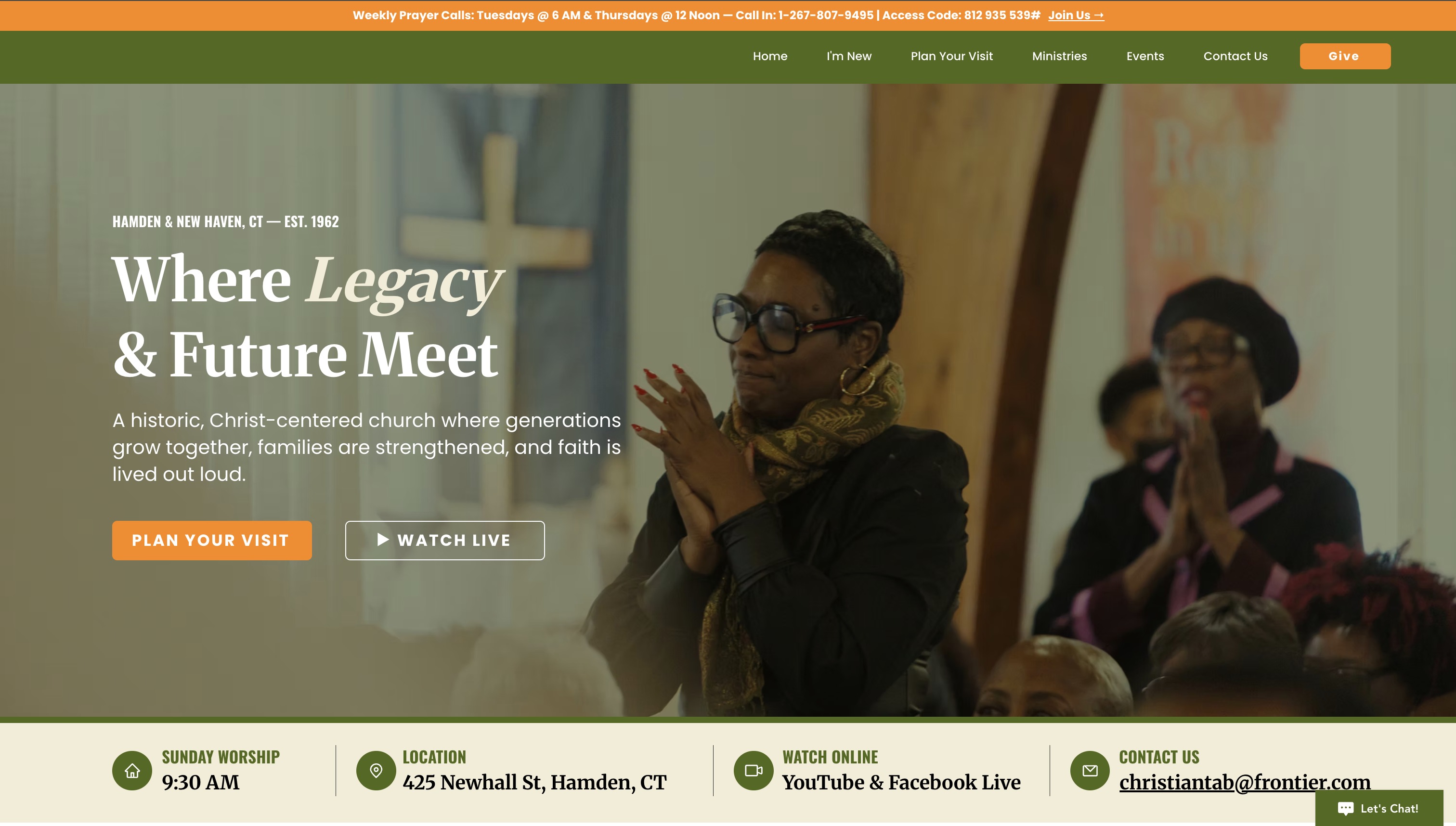
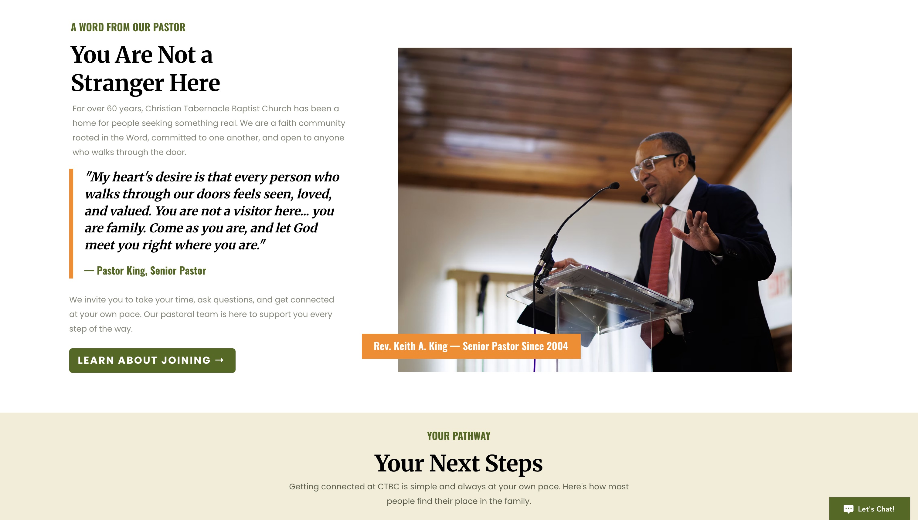
Every page was written and designed with that visitor type in mind. The homepage headline, “Where Legacy & Future Meet,” was chosen deliberately. It speaks to CTBC's 60-year history while signaling to younger visitors that there is room for them here. The professional photography that had been sitting unused was the backbone of every page, giving the site the visual warmth and authenticity that stock photography never could.
Key design decisions included a split-panel layout across all hero sections, a persistent announcement bar with service times and contact info, a prominent Give button in the navigation, and a dedicated ministry page that communicates breadth of involvement with a single, clear invitation: find your place.
Social Media Content Strategy
The social content strategy was built around three content pillars aligned to CTBC's core mission: legacy and history, ministry and community, and the next generation. Three posts per week on Facebook and Instagram, each designed to speak to both the longtime member and the person discovering CTBC for the first time.
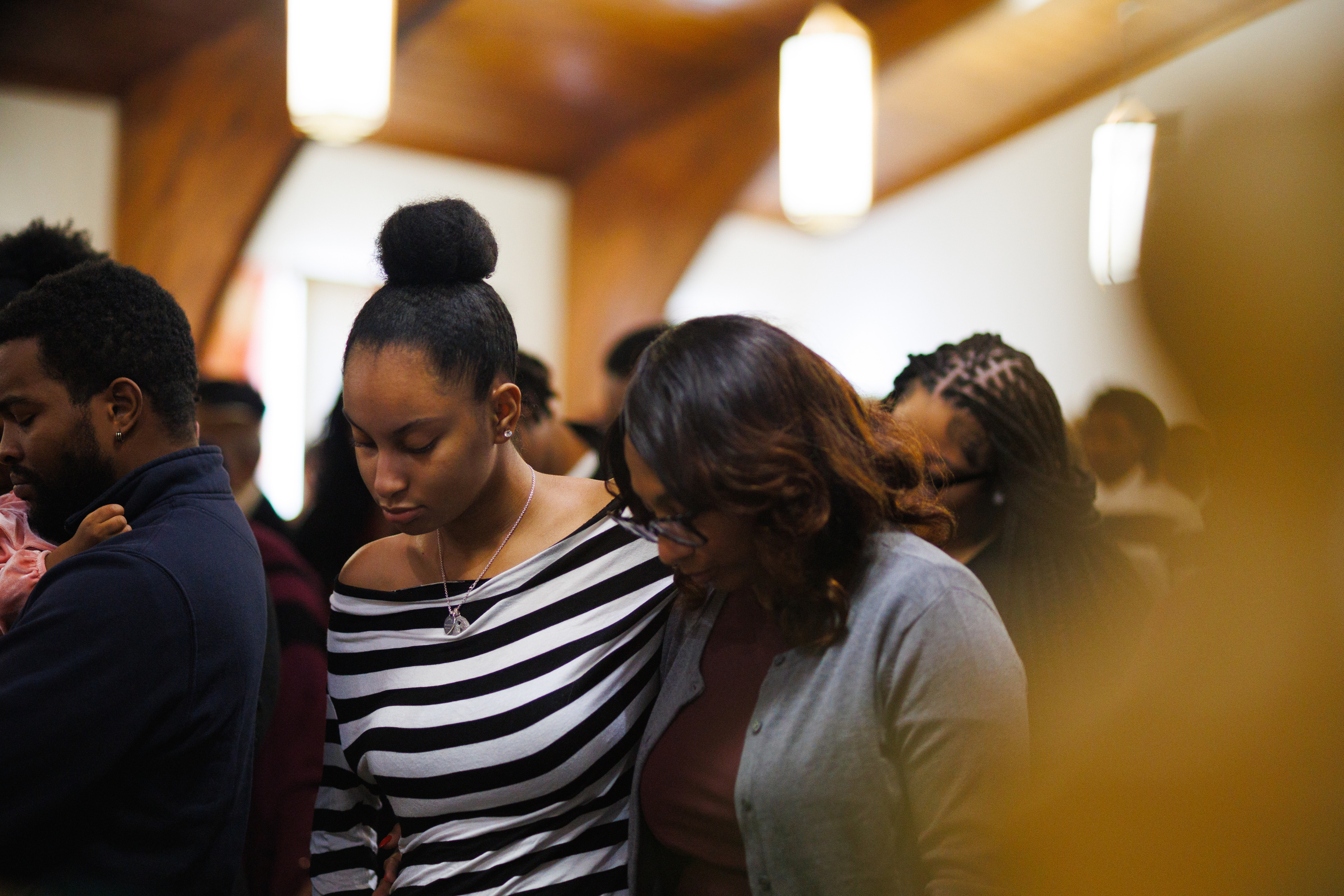
A significant part of the strategic value came from unlocking the photography archive. The professional images captured across multiple services gave every post a level of visual authenticity that stock photography cannot replicate. Congregation members in worship, prayer, community, and fellowship, shot with editorial quality, gave the content immediate credibility and warmth.
Content designed specifically for the younger demographic, like the “Future is Here” post, was intentionally crafted alongside legacy content to signal that CTBC is a church for every generation simultaneously, not by taking turns, but all at once.
Strategic Optimization & Visitor Connection
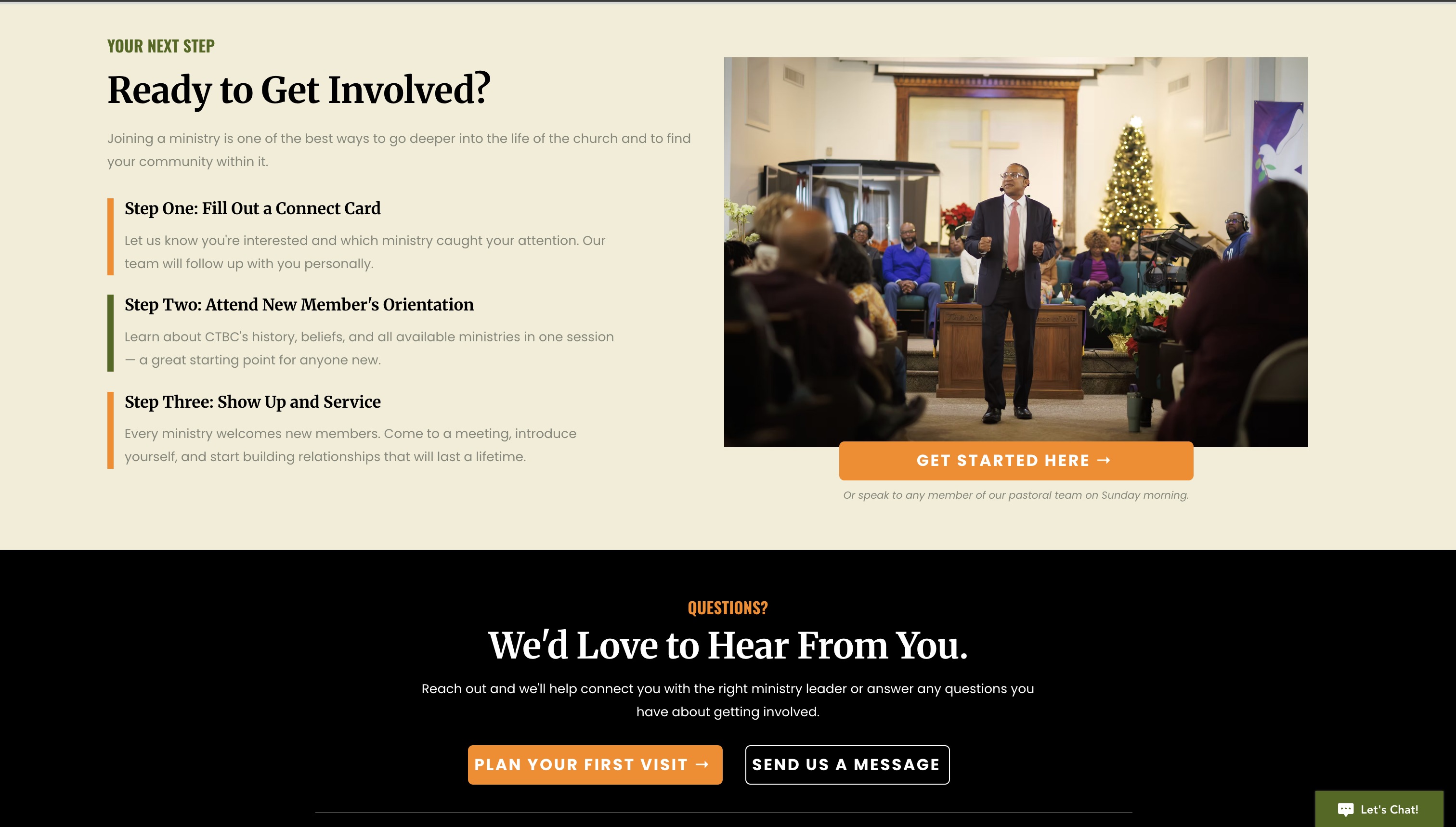
After the foundation launched, the partnership shifted into refinement. Six pages were optimized based on real-world leadership feedback. A hybrid Connect Card visitor capture system was designed and built to automate follow-up and pastoral connection. The online giving stack was audited and expanded. A phased implementation roadmap was built and executed to bring every piece of it live.
The Website Transformation
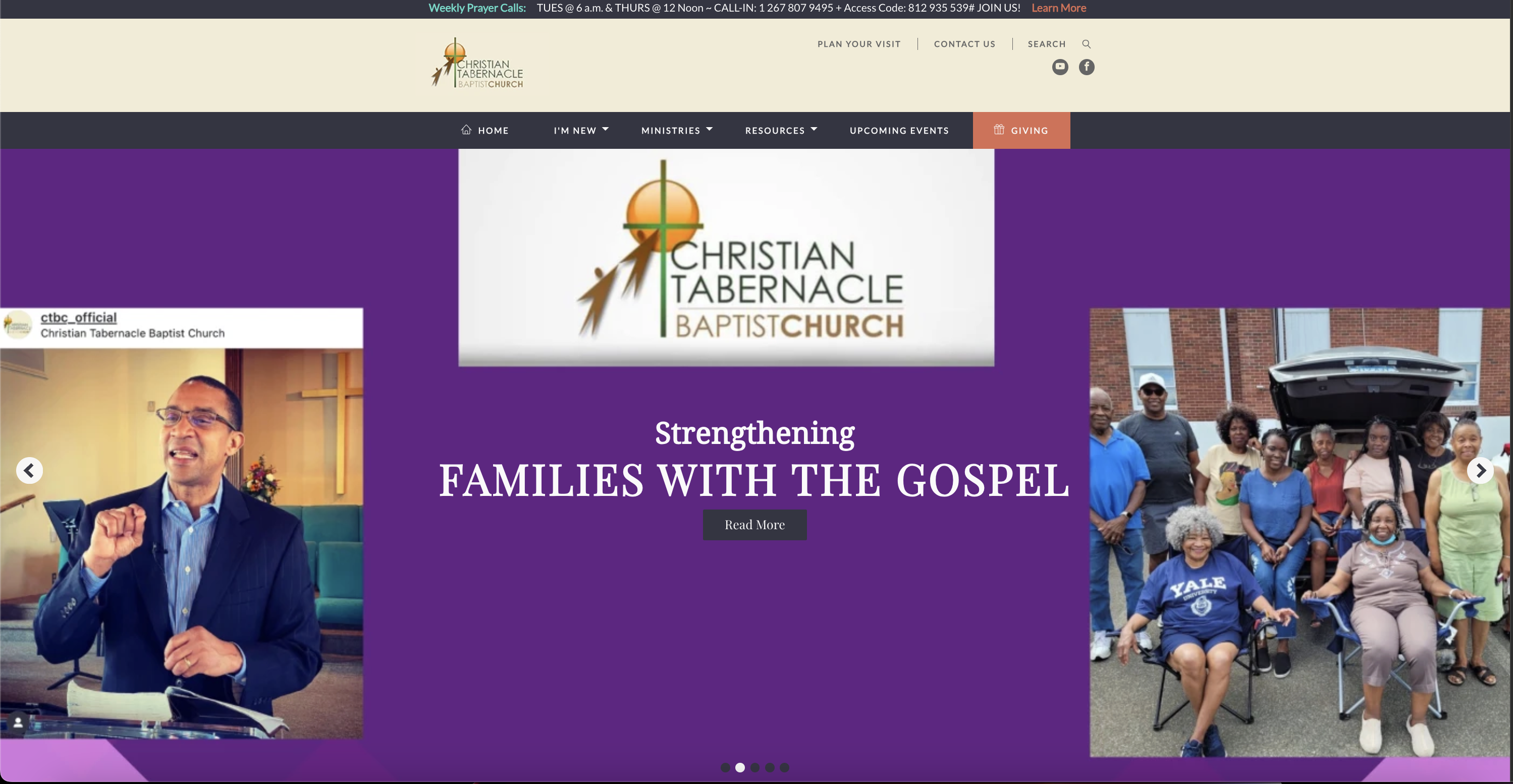
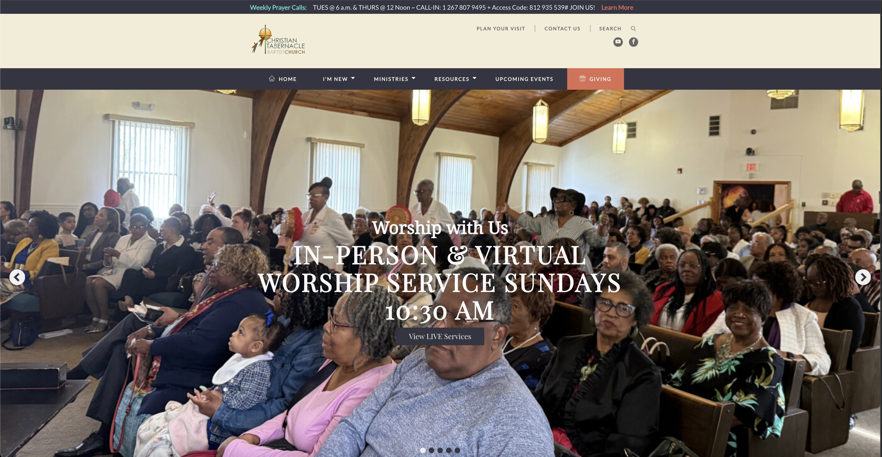
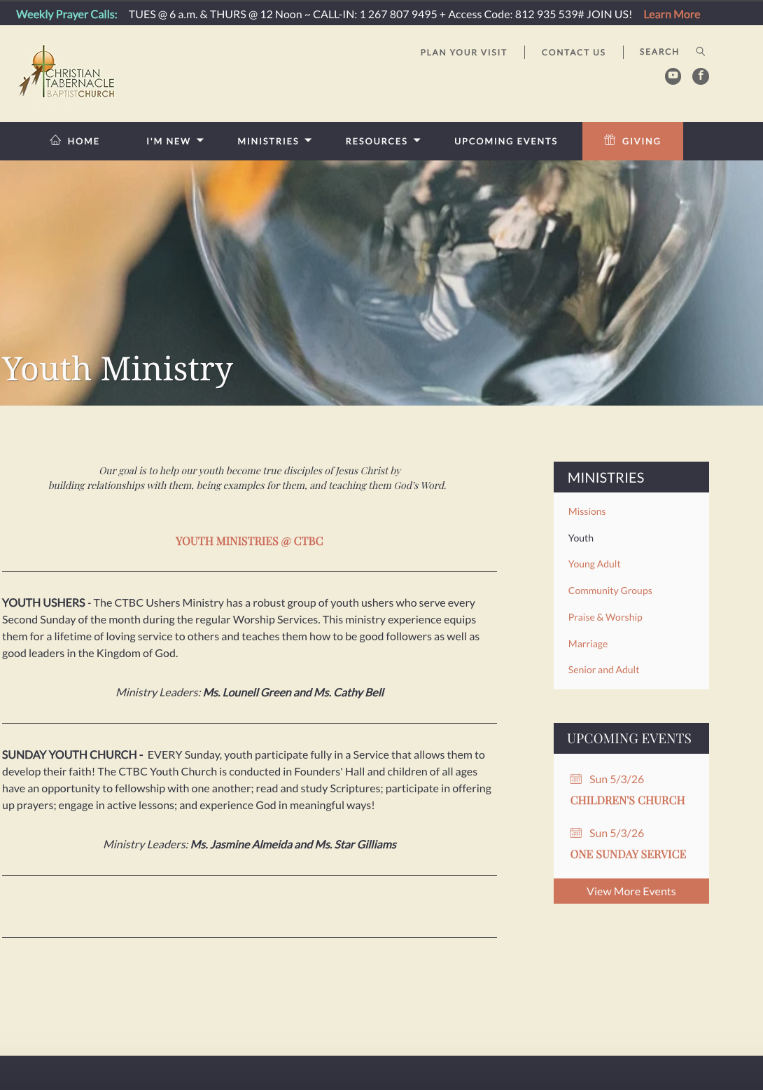
The old site had no visual system carrying across its pages. Stock photography stood in for real congregation moments. Colors shifted page to page. The new site was rebuilt on a single visual language with CTBC's own photography at the center of every page.
Pages Built
Before
A Complete Rebuild
The old site had no visual identity carrying across its pages. Purple backgrounds, a teal navigation bar, and an orange sphere logo sat side by side with real congregation photos and generic stock imagery. The colors changed page to page. Nothing said CTBC.
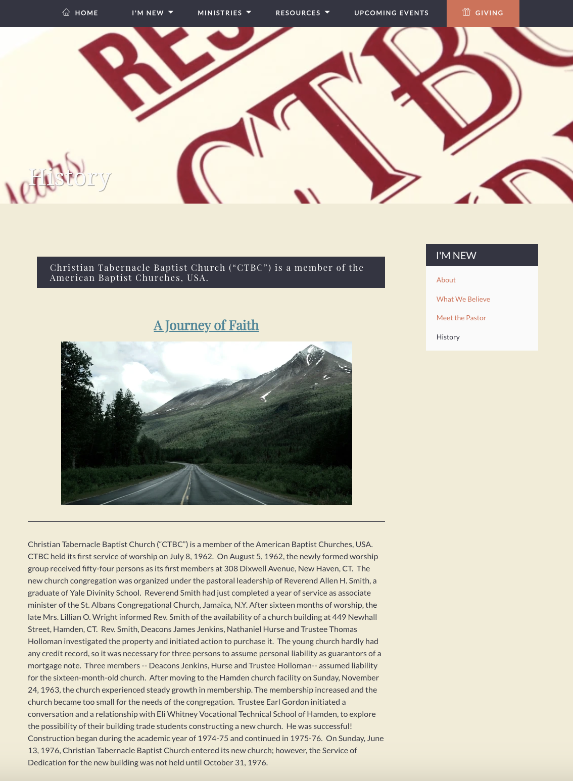
The most telling example: the History page used a stock photo of a mountain road as its hero image. A 60-year-old church with professional photography of its own congregation sitting in folders, and a stock photo was the face of its history.
The new site is built on a single visual system: forest green, harvest orange, and warm cream applied consistently across every page. Every hero image comes from CTBC's own photography archive. The homepage headline, “Where Legacy & Future Meet,” frames exactly who the church is and who it's reaching for.
After
Brand Kit
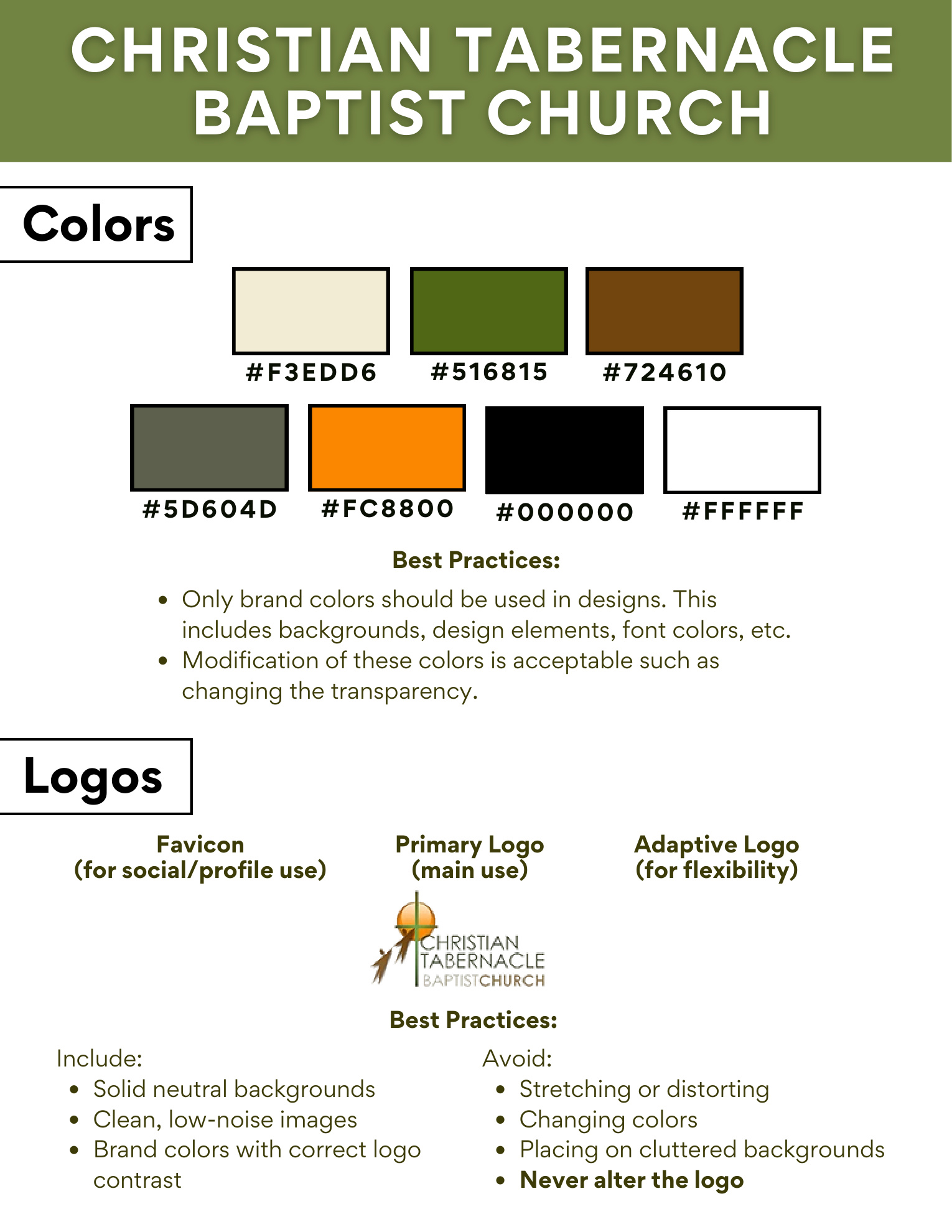
Delivered as a permanent, owned asset before any paid work began. The brand kit gives CTBC a visual language it can apply consistently across every platform, printed material, and digital touchpoint, regardless of who is creating the content.
Color Palette
Forest Green
#516815
Primary
Harvest Orange
#FC8800
Accent
Rich Brown
#724610
Secondary
Warm Cream
#F3EDD6
Background
Sage
#5D604D
Secondary
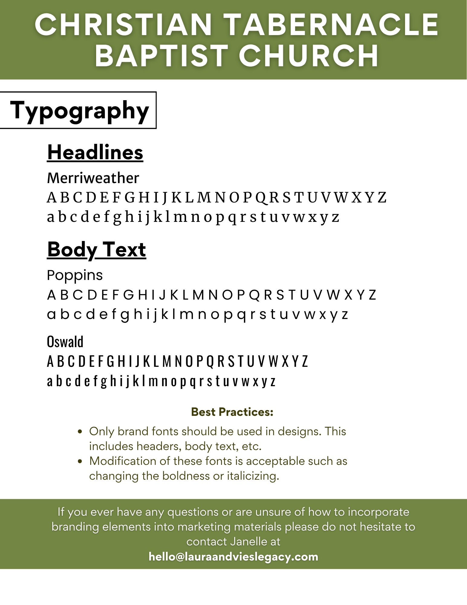
Typography
Headlines
Merriweather
A legacy built on faith.
Body Text
Poppins
Where every generation belongs.
Accent Text
Oswald
ROOTED SINCE 1962
What the Client Receives
The brand kit is a fully designed PDF document the client owns permanently. It documents every visual decision, with usage examples, hex codes, font pairings, and logo guidelines, so any team member or future vendor can apply the brand correctly without guesswork.
Content Built for Both Crowds
Seven posts created for Facebook and Instagram, each drawing on the professional photography archive and written to speak to CTBC's dual demographic: the congregation that has been here for decades, and the generation the church is working to reach. Content is currently in client review prior to publishing. Click any image to view the full post and caption.
The Visual Shift
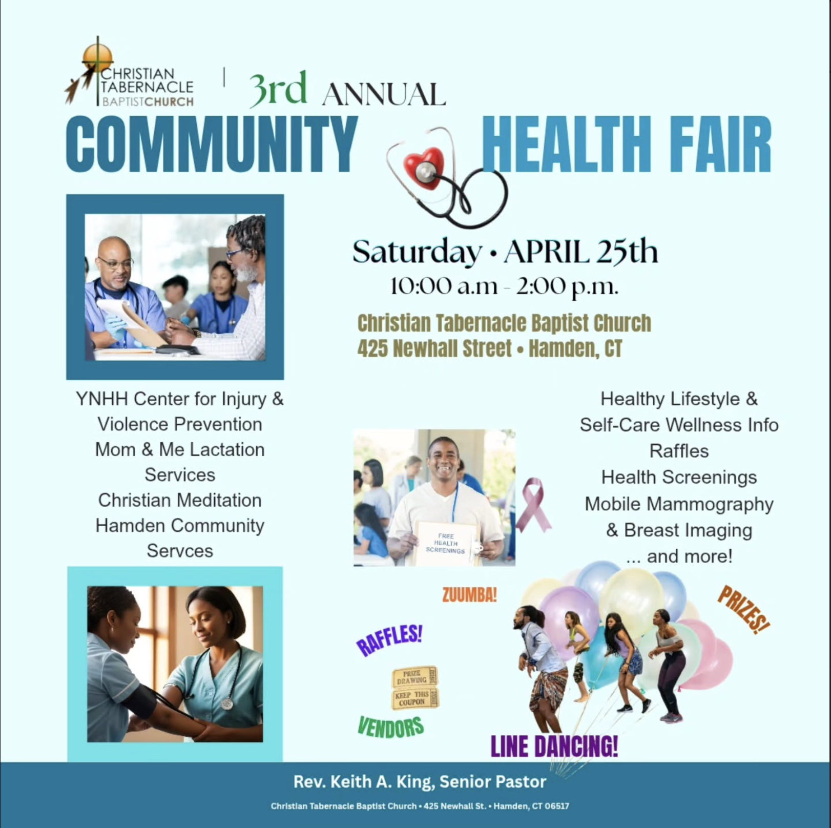
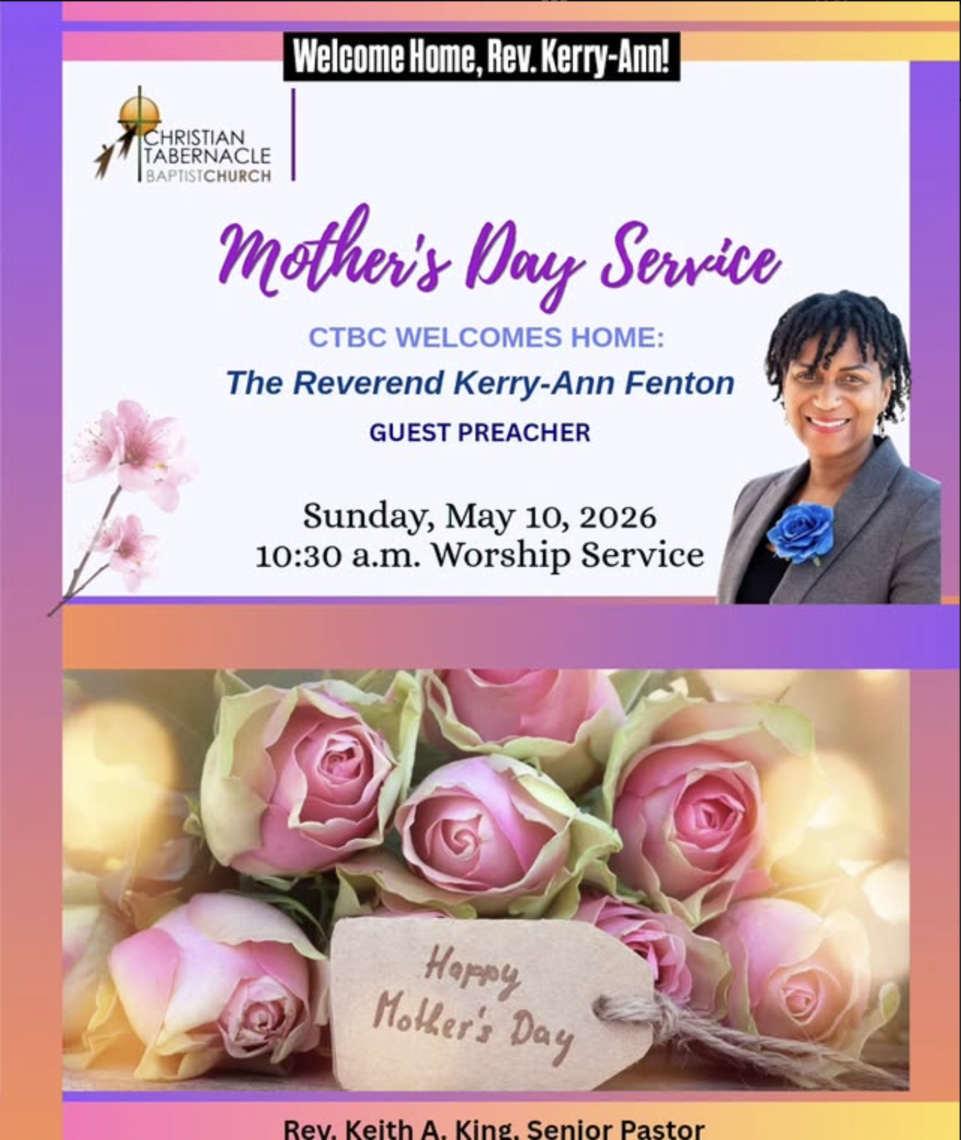
Two posts. Two completely different color palettes, font choices, and visual languages. Nothing signals that these came from the same church.
Every problem in those two flyers traces back to the same root: no brand system to work from. With a documented identity in place, each of those issues is solved by default.
One documented type system: Merriweather for headlines, Poppins for body copy, Oswald for accent text. Applied the same way on every post.
Before: Multiple fonts per flyer
Forest green, harvest orange, and warm cream are defined in the brand kit. Every post pulls from the same palette, regardless of the occasion.
Before: Colors chosen per event
CTBC’s professional photography archive replaces clipart entirely. Real congregation moments on every post.
Before: Stock clipart and generic imagery
The CTBC logo appears on every piece of content. Two posts from different months still read as coming from the same organization.
Before: No recognizable church identity
Click any image to view the full post with caption.
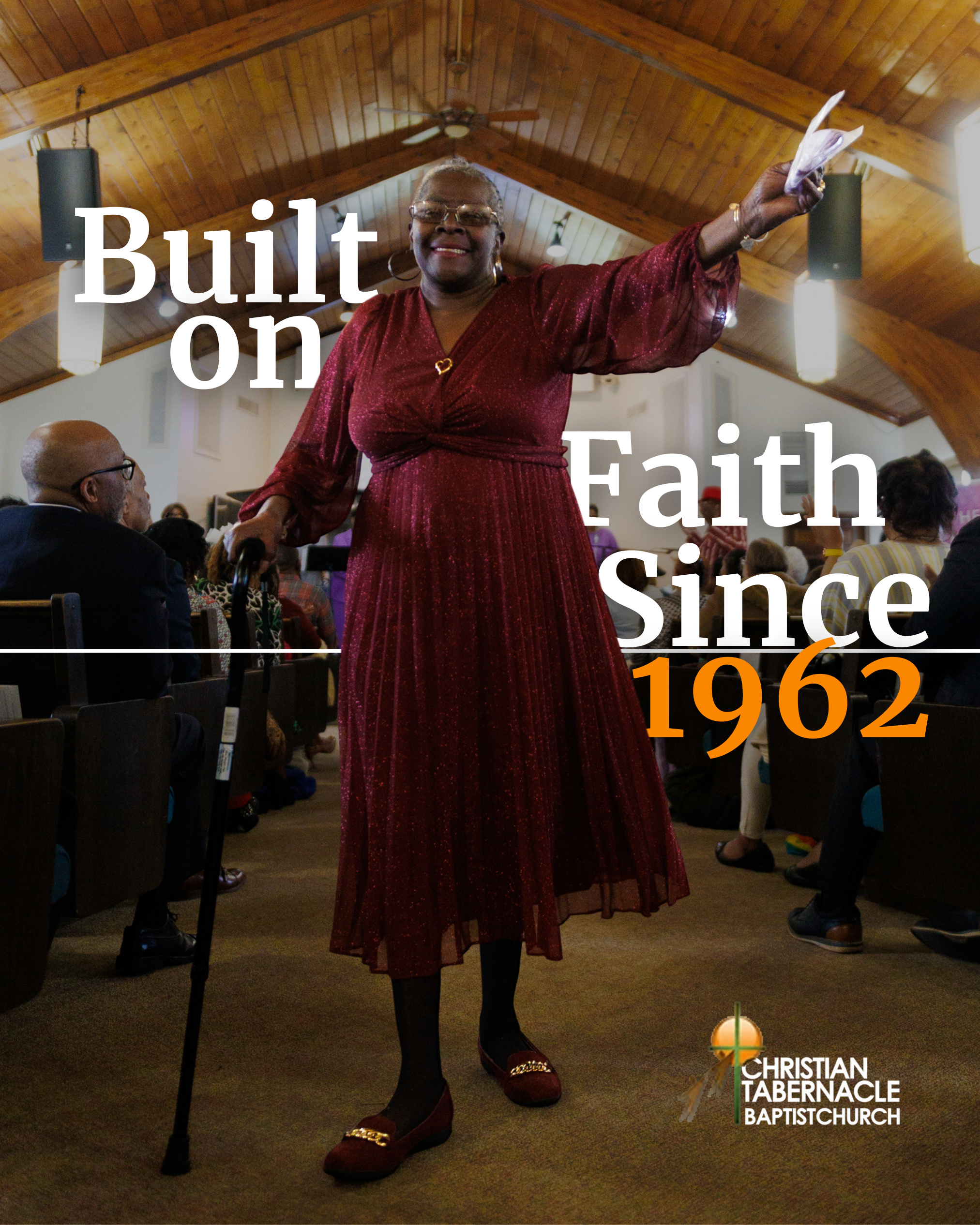
Built on Faith
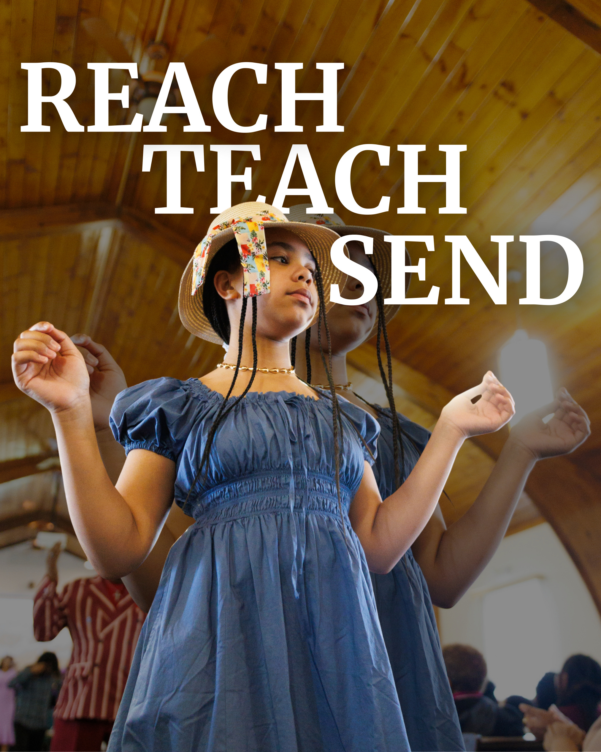
CTBC Mission
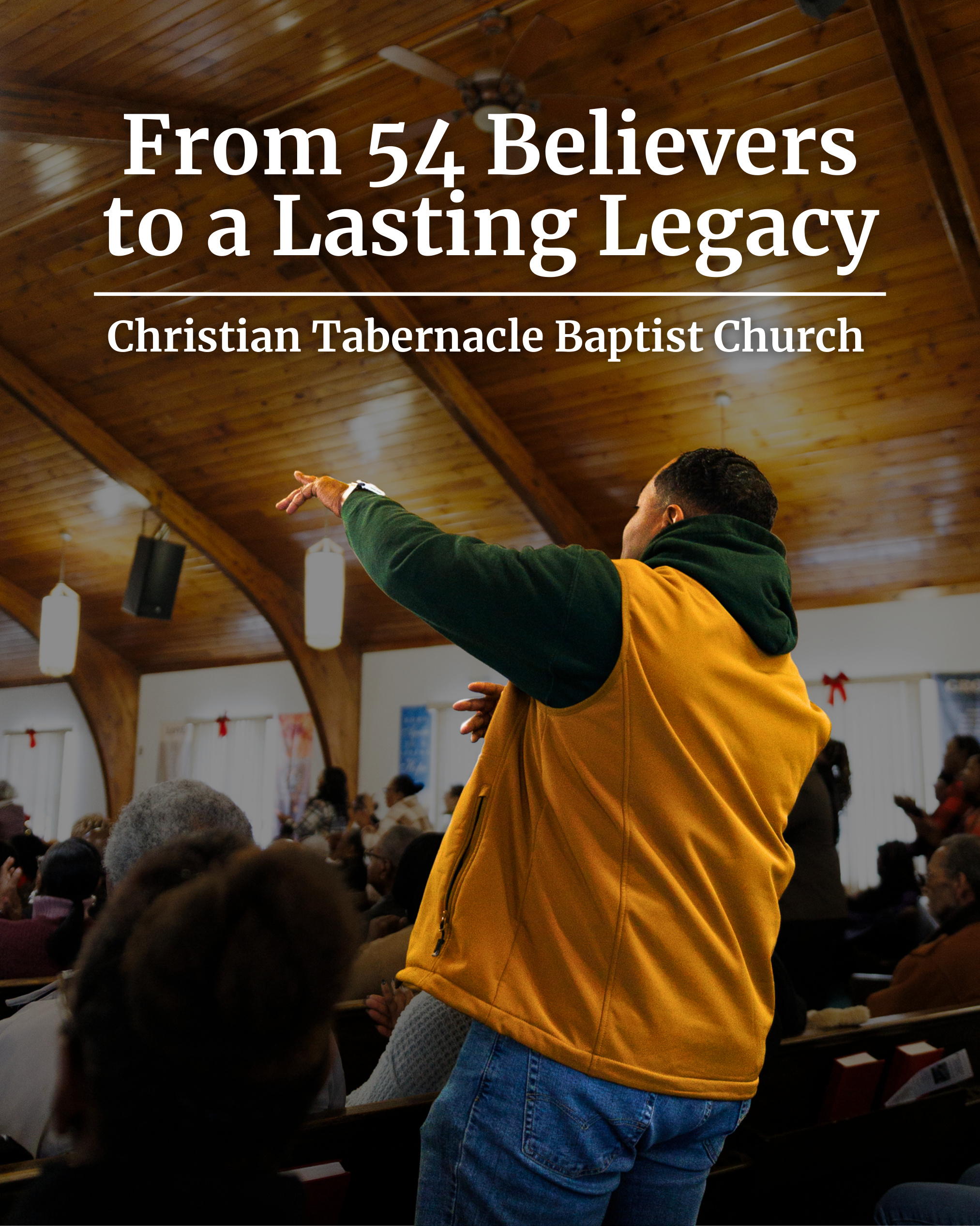
Since 1962 (8-Slide Carousel)
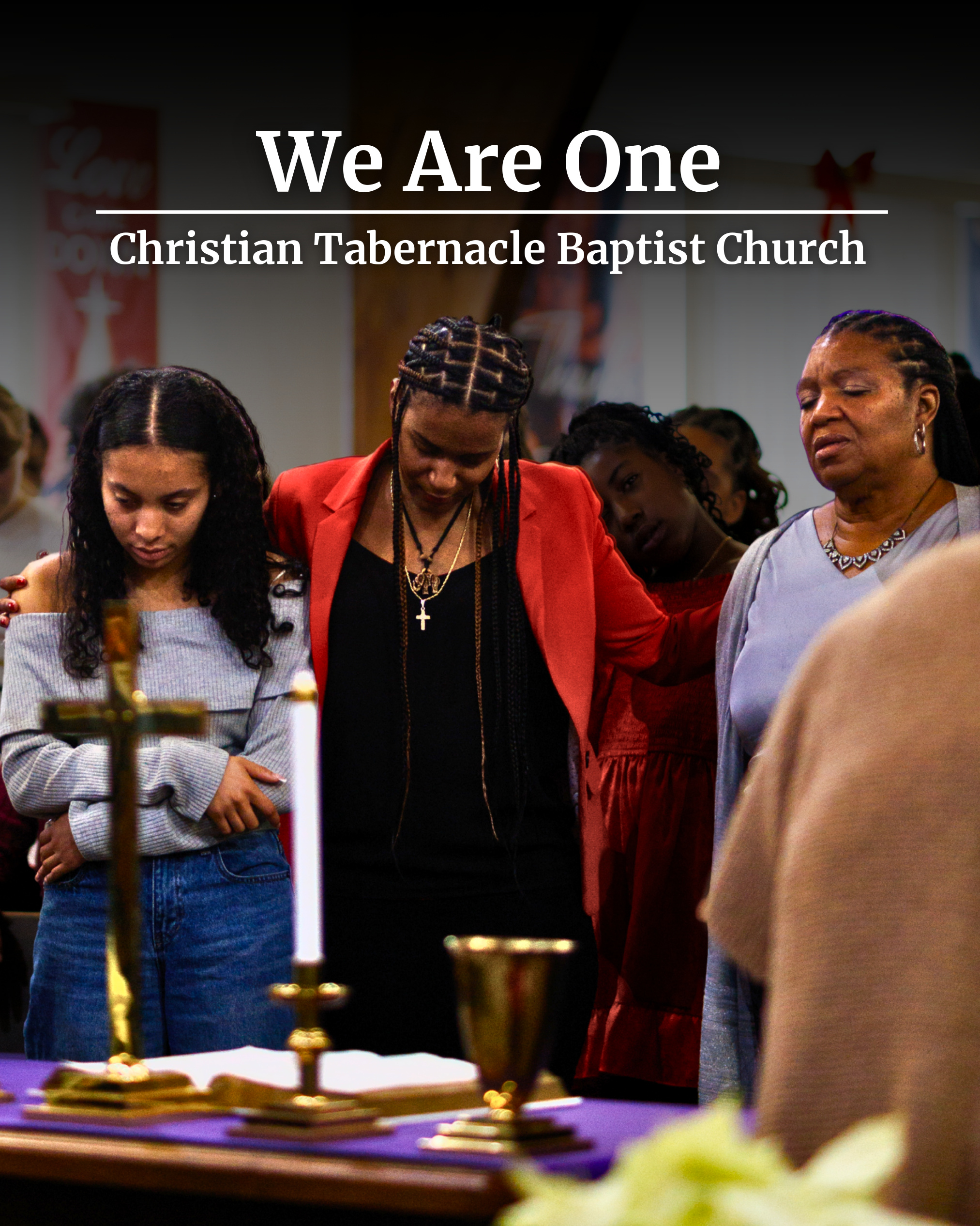
We Are One (6-Slide Carousel)
The Photography Was Always There
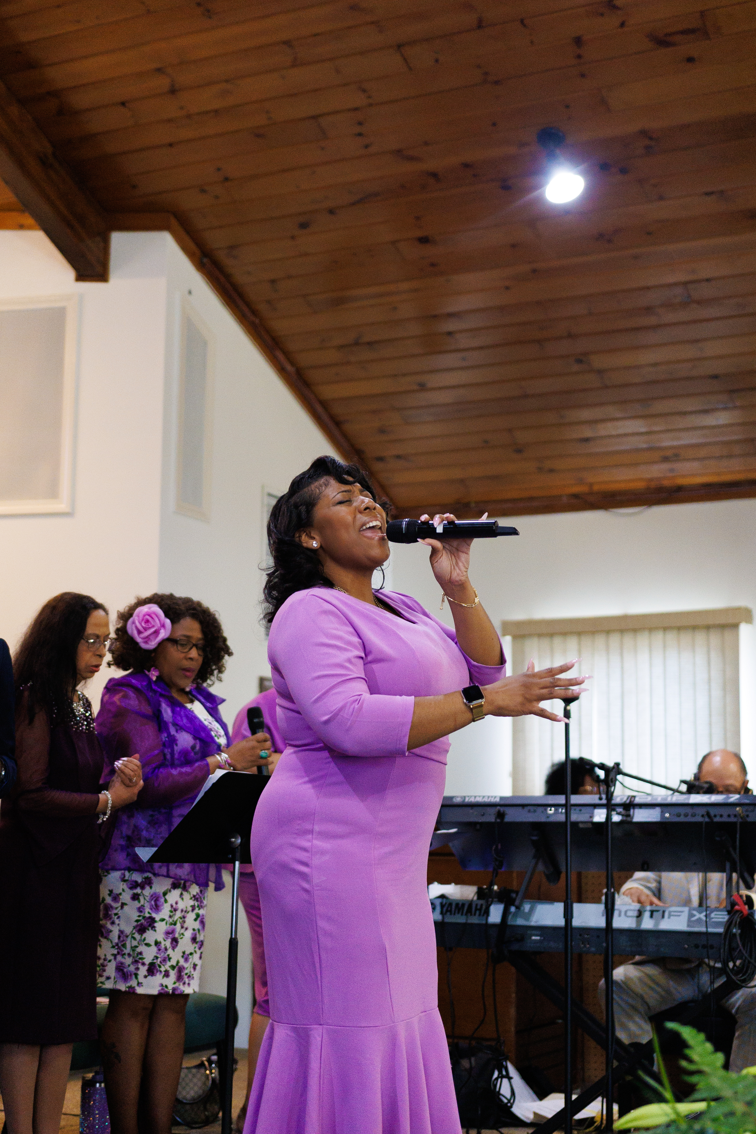
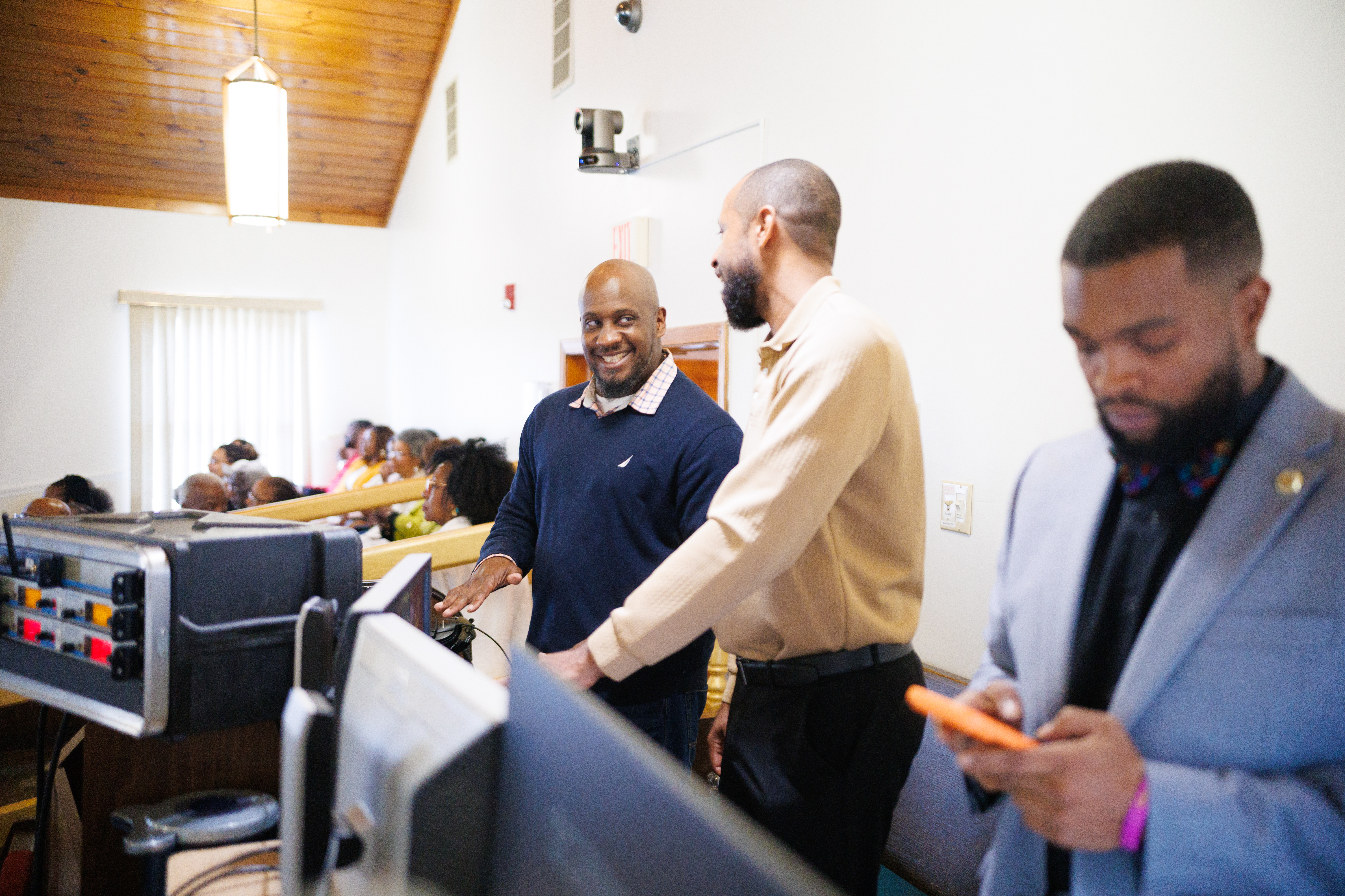
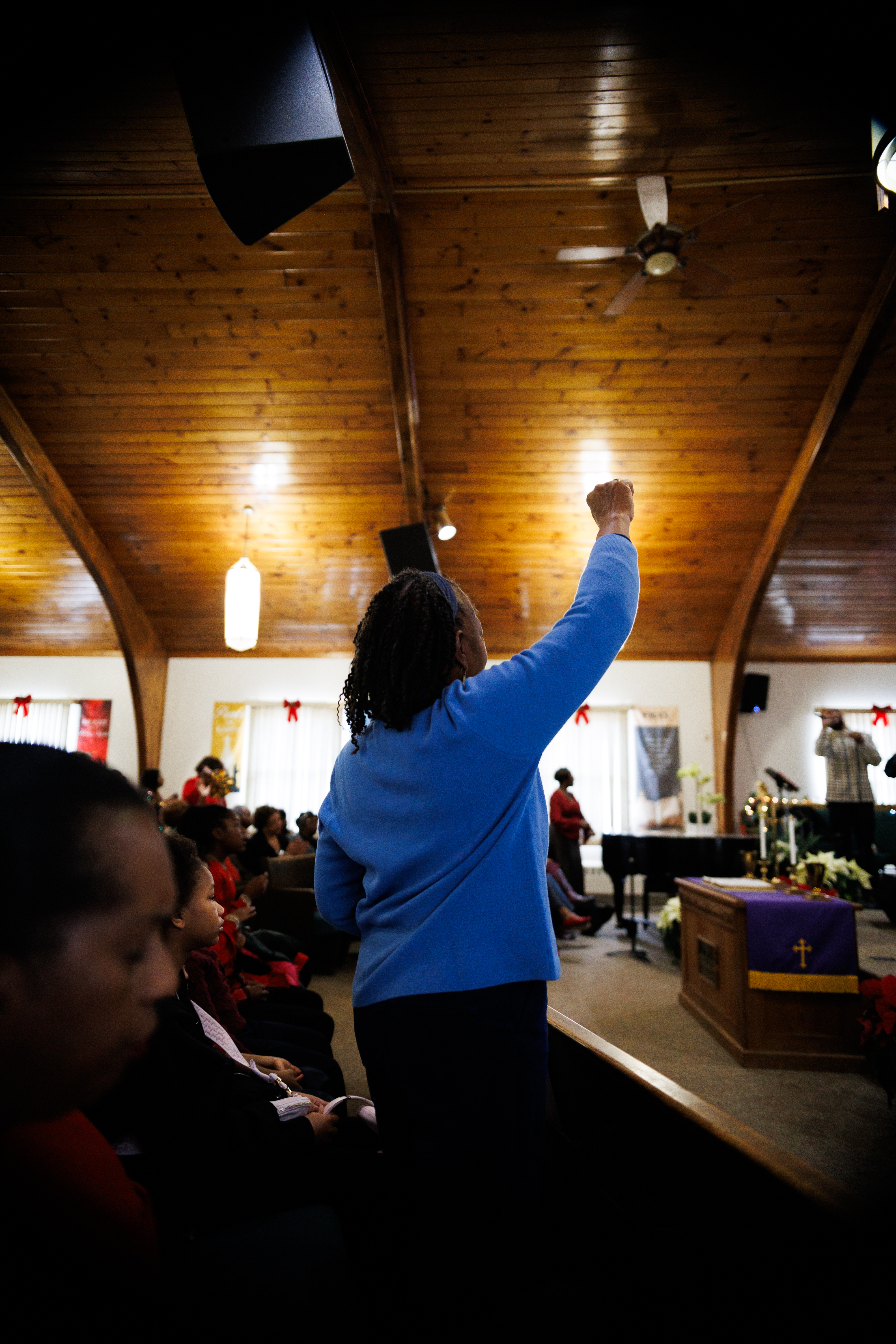
One of the most significant unlocks of this engagement wasn't creating something new. It was activating what already existed. CTBC had invested in professional photography across multiple services and events. The resulting images were editorial in quality: candid moments of worship, multigenerational connection, and authentic community life.
None of it had been used publicly. It sat in folders, unseen.
Every page of the website, every social post in the initial content library, is built on that photography. It is the difference between a church that looks like a stock template and one that looks like a living community. Churches investing in professional photography need someone who knows how to activate it. That was the work.

Strategic Optimization & Visitor Connection
Once the foundation was live and working, the partnership evolved. Phase 2 moved from building to refining — deepening the visitor experience, creating systems to capture and nurture new connections, and expanding the tools available to members who want to give. Every decision was driven by real-world feedback, leadership input, and a clear strategy for sustainable engagement.
Website Optimization
All six pages were revisited and refined based on leadership feedback and evolving ministry needs. Updates moved each page closer to its intended purpose — serving the specific visitor or member standing in front of it.
Connect Card System
Most churches have a digital presence but no system to capture the people who encounter it. The Connect Card closes that gap — a hybrid digital and physical visitor capture system designed to turn first-time Sunday guests into ongoing relationships.
The digital form is accessible by QR code during Sunday service. On submission, it triggers an automated welcome sequence to the visitor and a direct notification to pastoral staff — with stated interests, preferred contact method, and any prayer requests included. The physical card mirrors the digital experience for members more comfortable with pen and paper, feeding into the same 24-hour follow-up workflow.
Research shows 67% of guests who complete a connection card become regular attendees. The system CTBC now has is built to capture that moment and respond with intentionality.
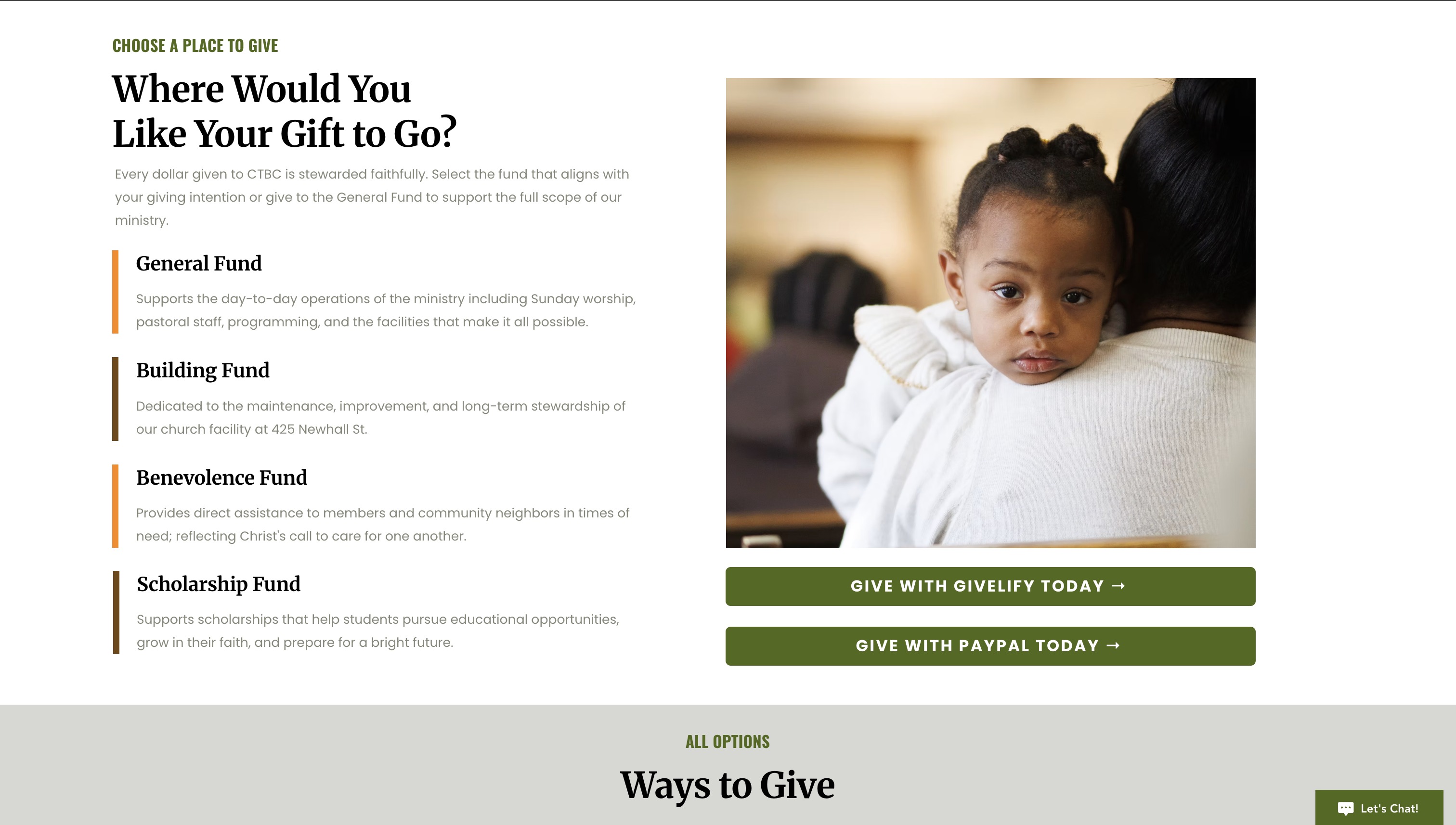
Online Giving Expansion
CTBC's original giving setup was functional but limited. A full audit of the church's giving stack surfaced clear opportunities to expand accessibility without adding operational complexity.
The resulting analysis covered every major giving platform available to nonprofits and faith communities — evaluating cost structure, ease of use, fit for CTBC's specific congregation, and projected return on investment. The recommendation identified high-impact additions that would meet donors where they already are, alongside clear guidance on what not to add and why. Cost projections were modeled at realistic giving levels so leadership could make an informed, data-backed decision.
Implementation Roadmap
Every Phase 2 recommendation required more than a list of things to do — it required a coordinated, sequenced rollout that accounted for leadership approvals, staff capacity, and the realities of a Sunday-centered organization.
A phased implementation roadmap was built and executed: from platform approvals and technical setup through staff training and Sunday service launch. The work moved from research to recommendation to live deployment with intention and a clear plan at every stage. Technical setup, staff training, and donor-facing communication were all included. Leadership made decisions. I handled the complexity.
An Ongoing Partnership
This is the beginning, not a finished campaign.
The goal with CTBC is not a one-time deliverable. It is a long-term communications partnership where I grow alongside the church, managing their full marketing and communications presence as the relationship deepens and the strategy evolves.
Phase 2 deepened the foundation with website optimization, a visitor capture system, and an expanded giving stack. The work ahead moves into measurement and momentum — tracking performance, growing community engagement, and building campaign support as the partnership continues to evolve.
Why This Work Matters to Me
I was born and raised at Christian Tabernacle Baptist Church. I grew up in those pews. I know the names of the people in those photographs. This is not a client I came to through a referral. It is a community I was shaped by and am choosing to pour back into.
I am also the demographic CTBC is working to reach. As a young adult who knows the church from the inside, I understand both what keeps people connected and what creates distance. That perspective is not something an outside consultant can manufacture. It informs every decision, from the copy on the homepage to the content framing of a post about the youth ministry.
Serving local churches is not a line item in a business plan. It is a core part of why Laura & Vie's Legacy, LLC exists. CTBC is the first church I have served in this capacity. It will not be the last.
Does your church need this kind of support?
If your church has untapped photography, an inconsistent online presence, or a congregation you're struggling to reach beyond Sunday morning, let's talk.